Brief
Launch a new pair of typefaces available in both sans serif and slab serif variants.
Solution
A complete launch campaign including naming, creative development, design, print, fulfilment, social media support, PR and advertising.
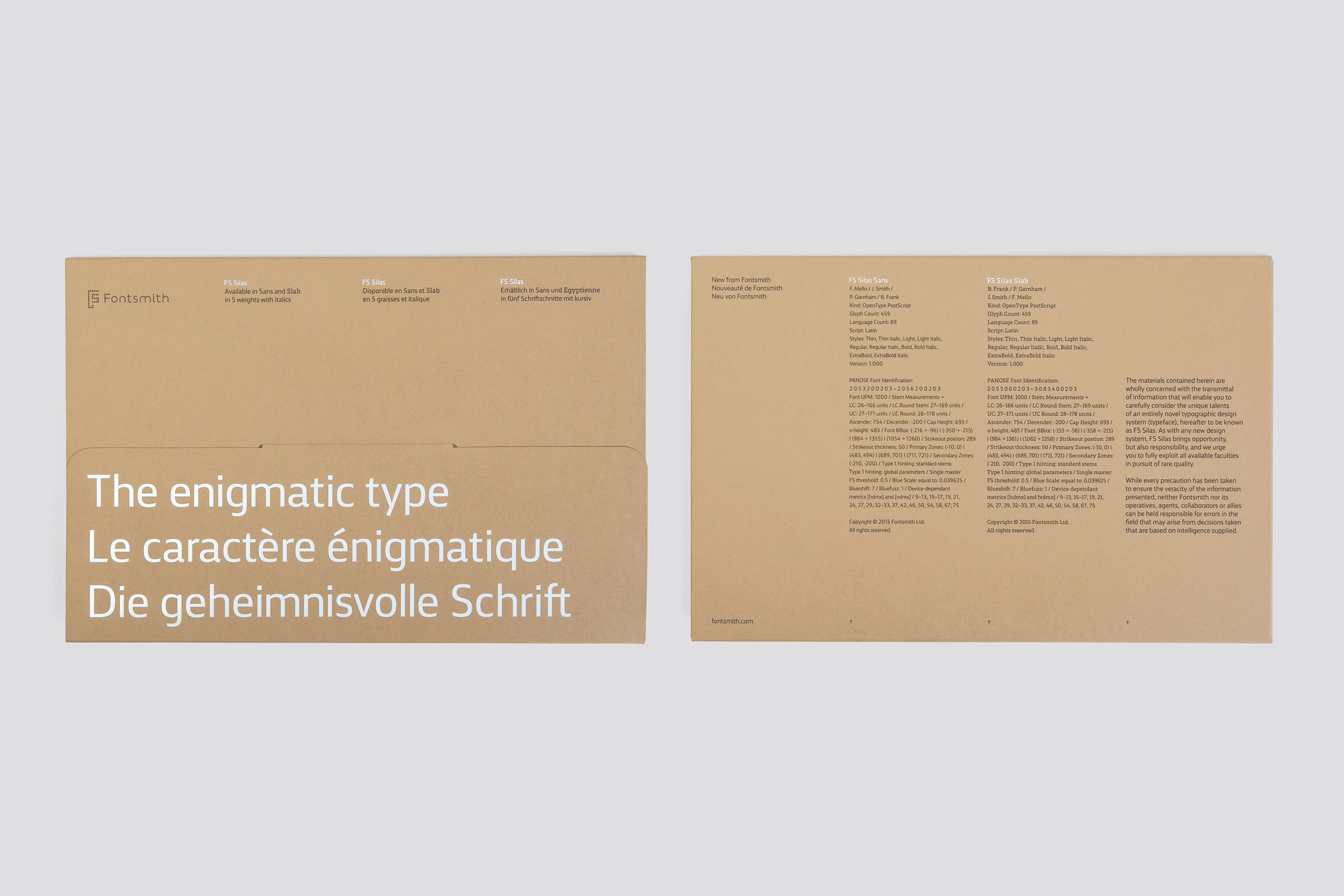
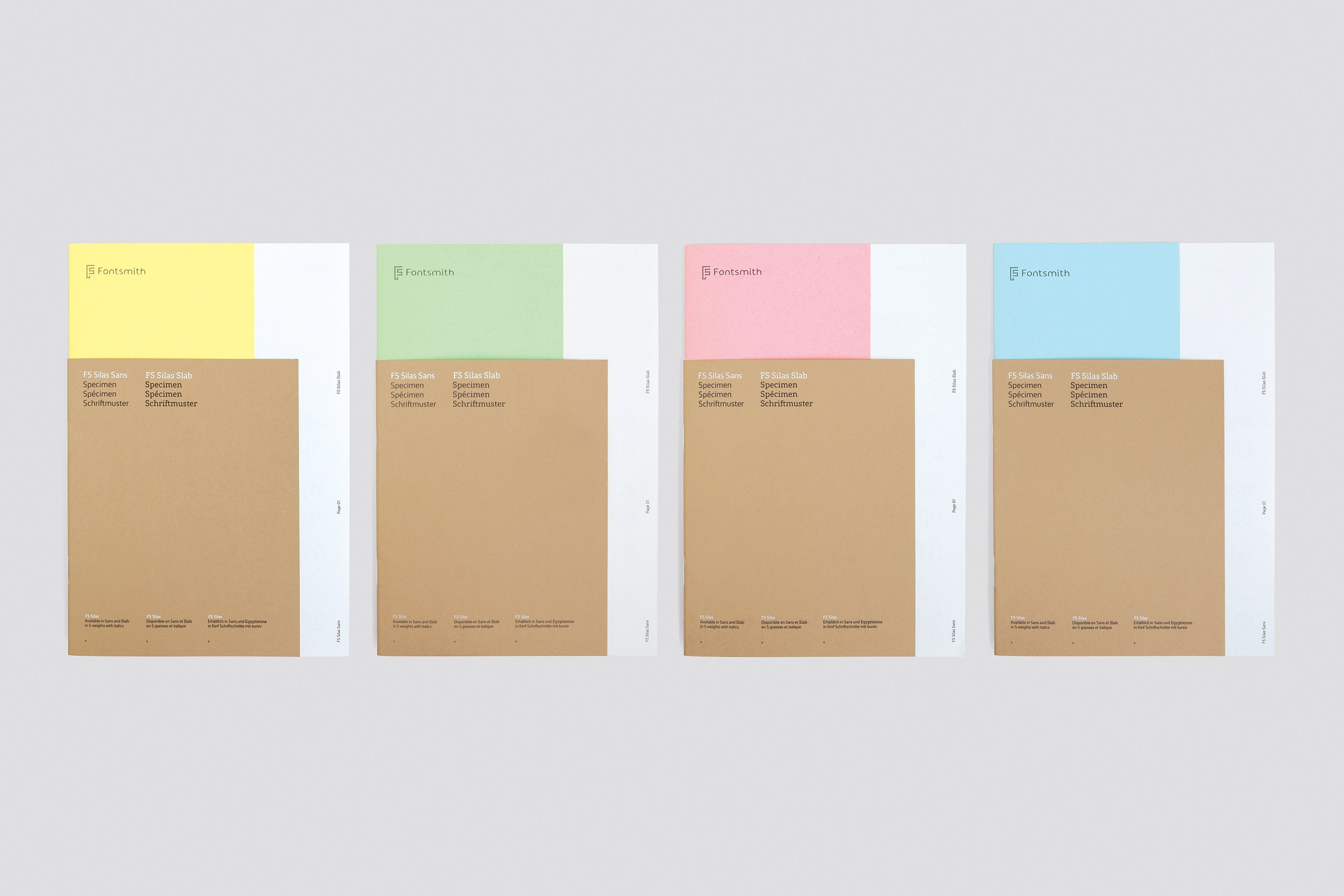
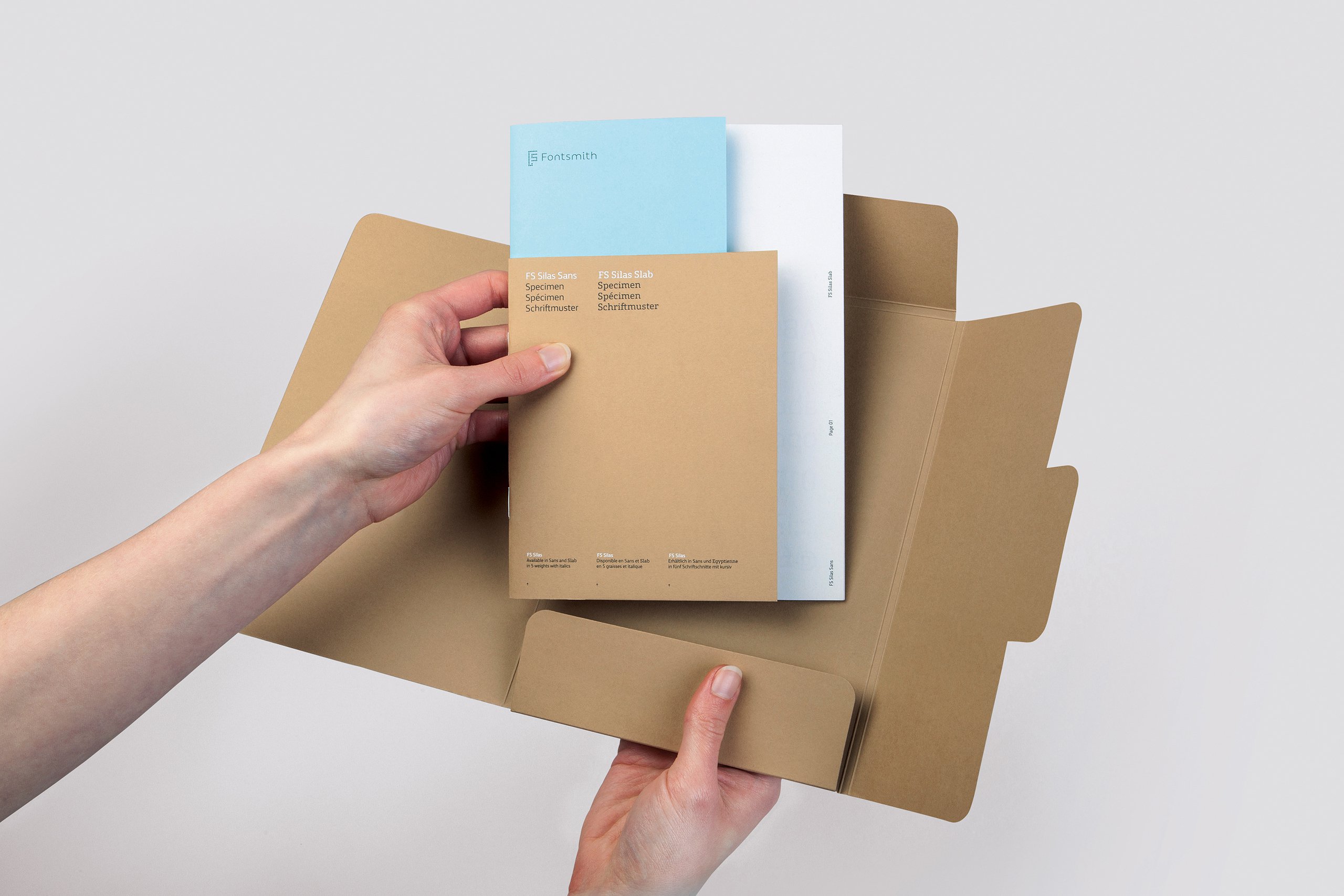
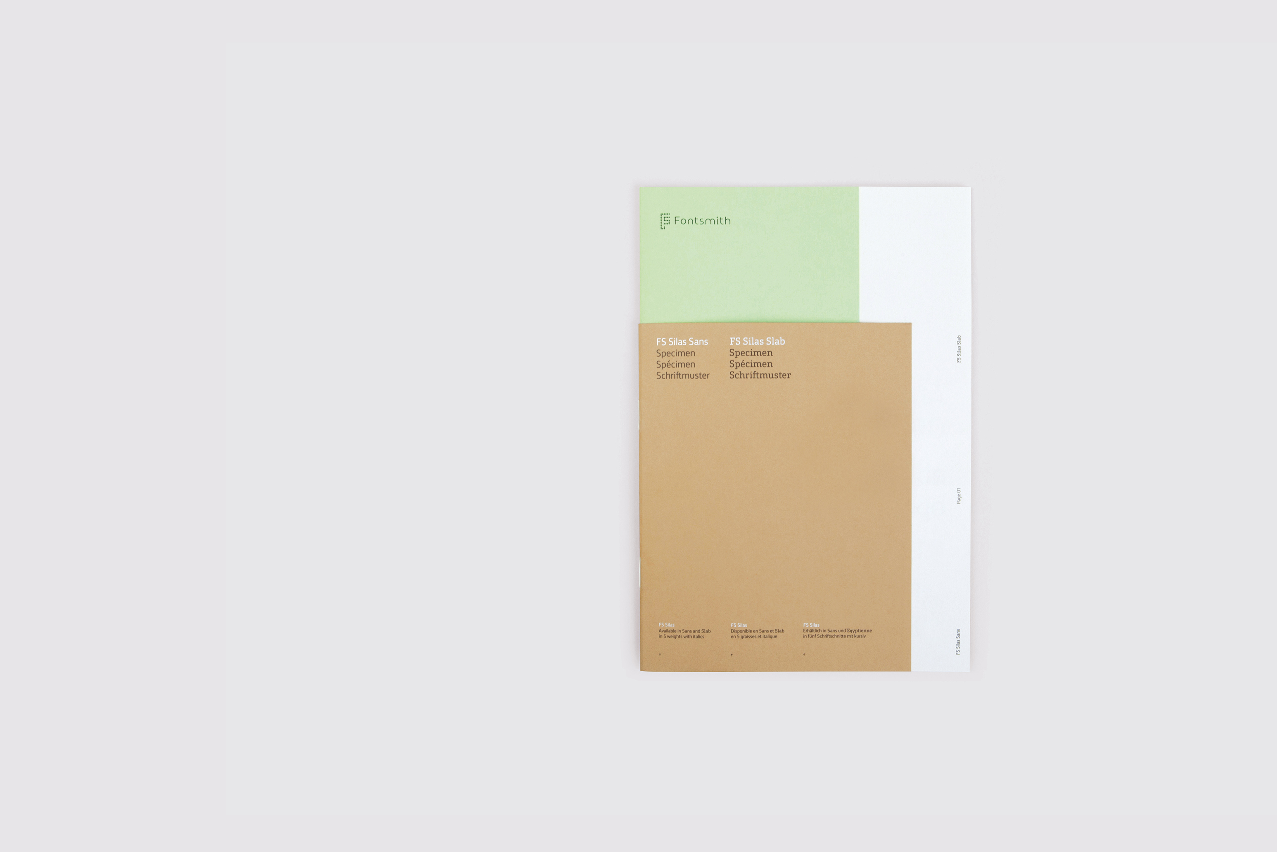
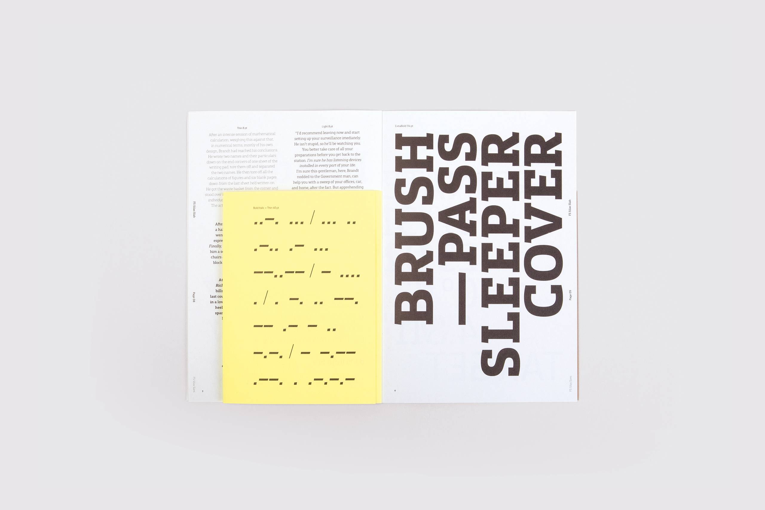
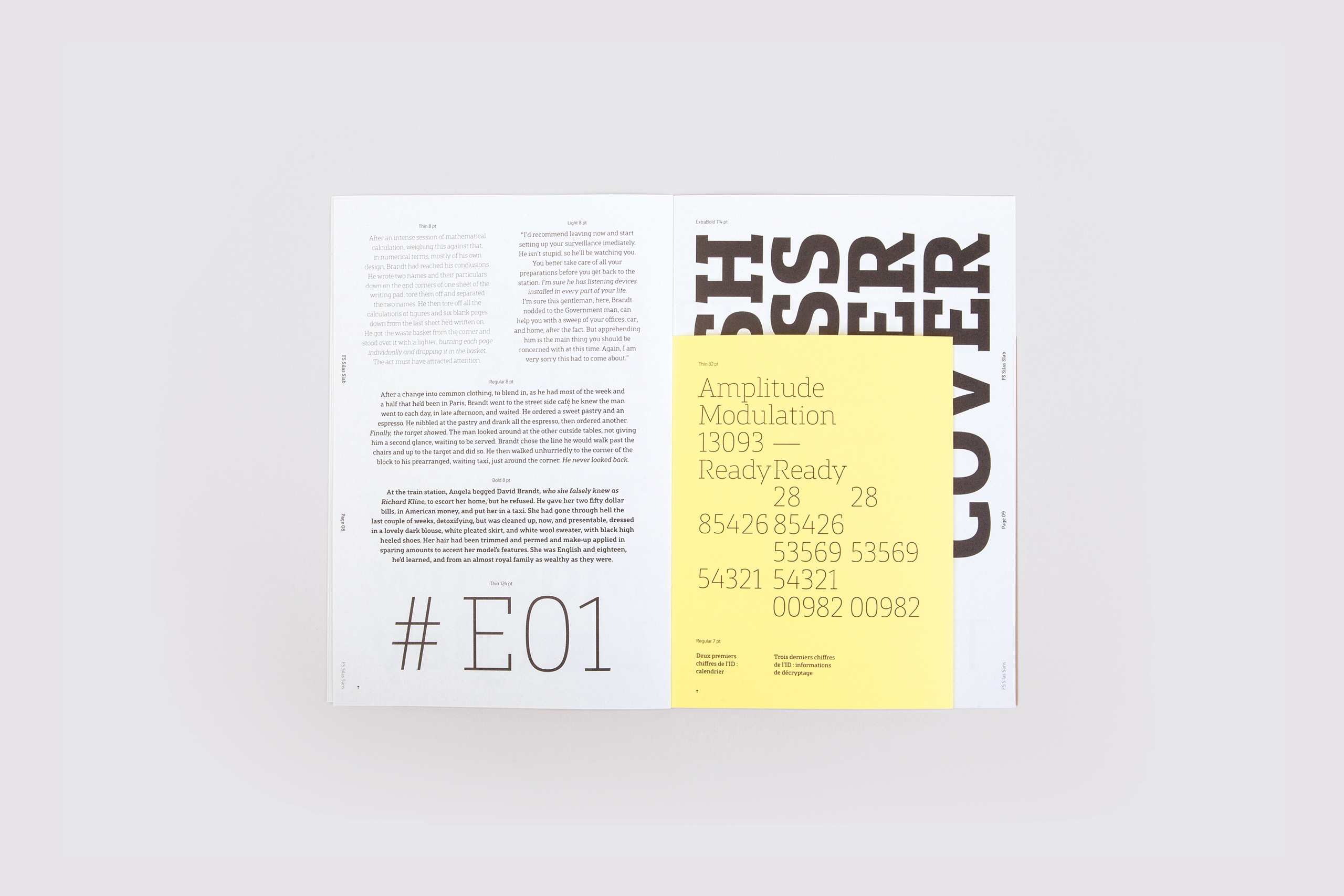
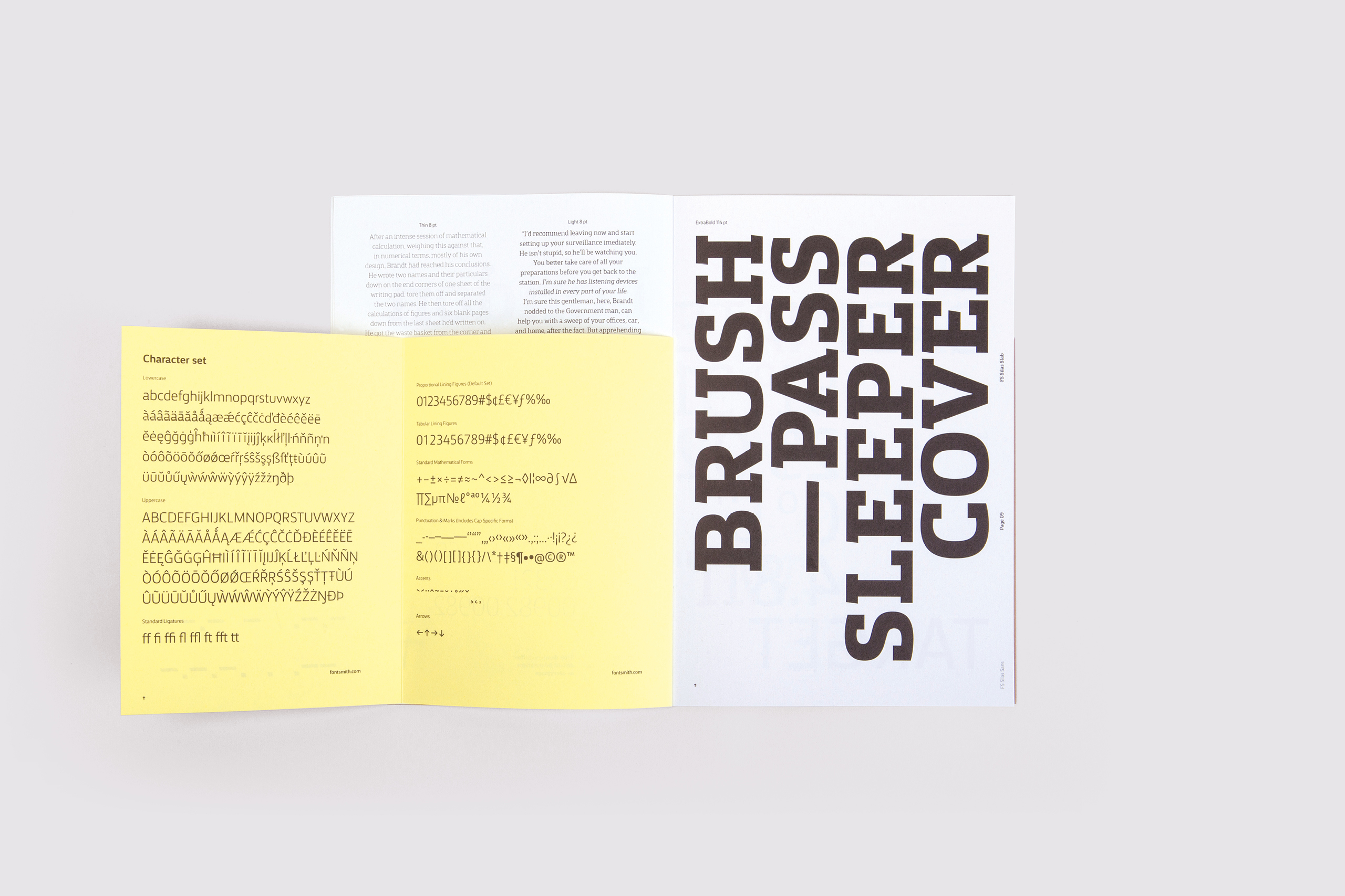
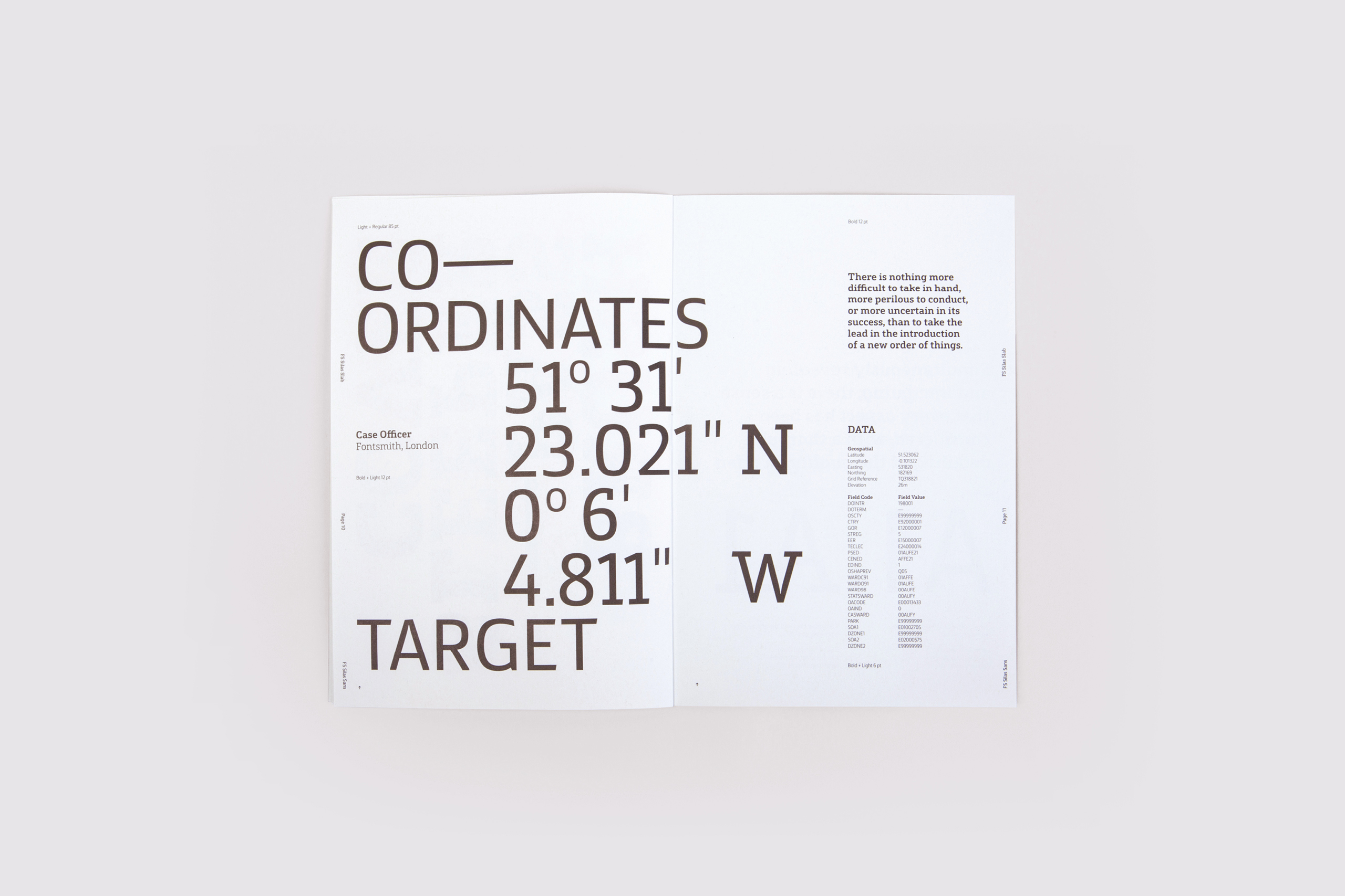
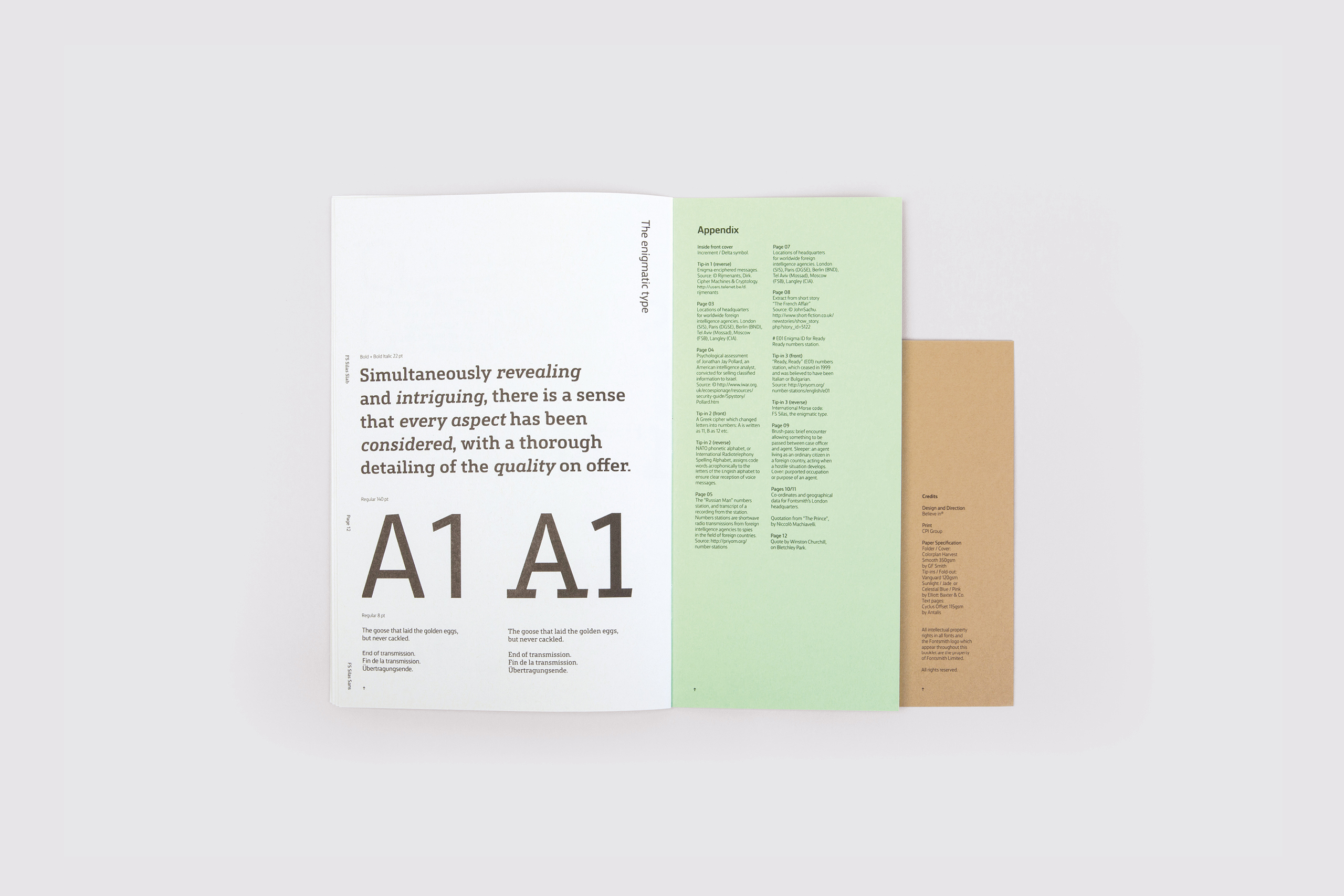
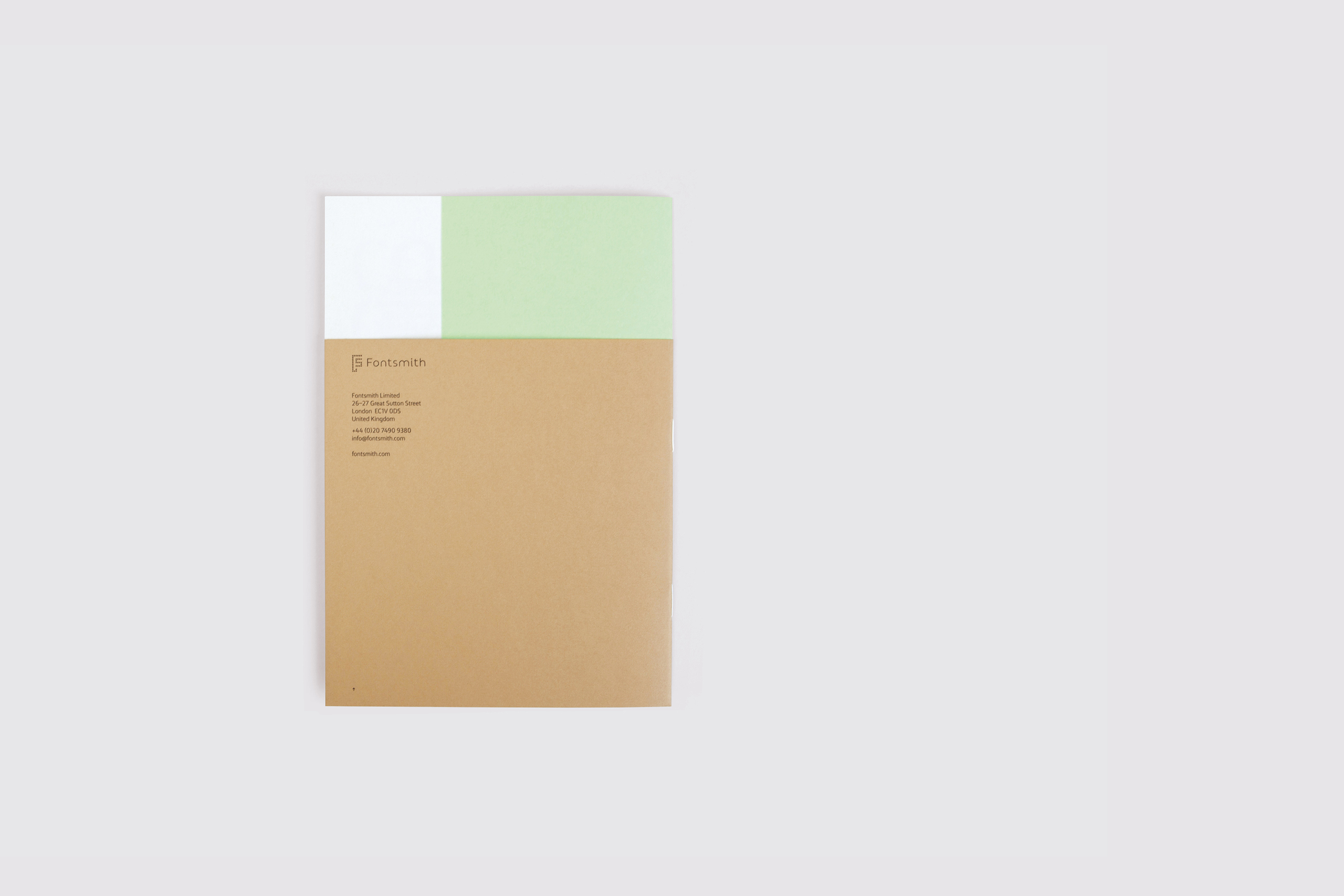
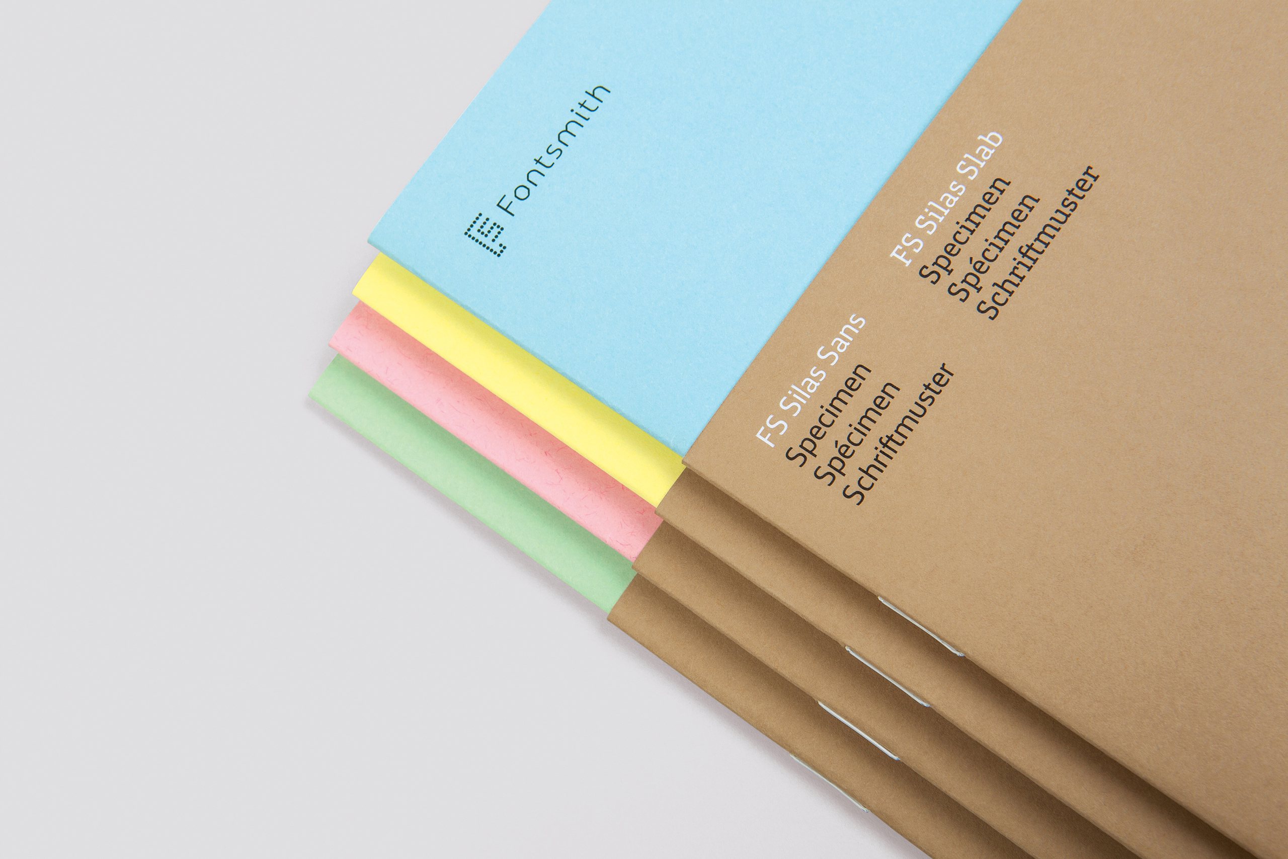
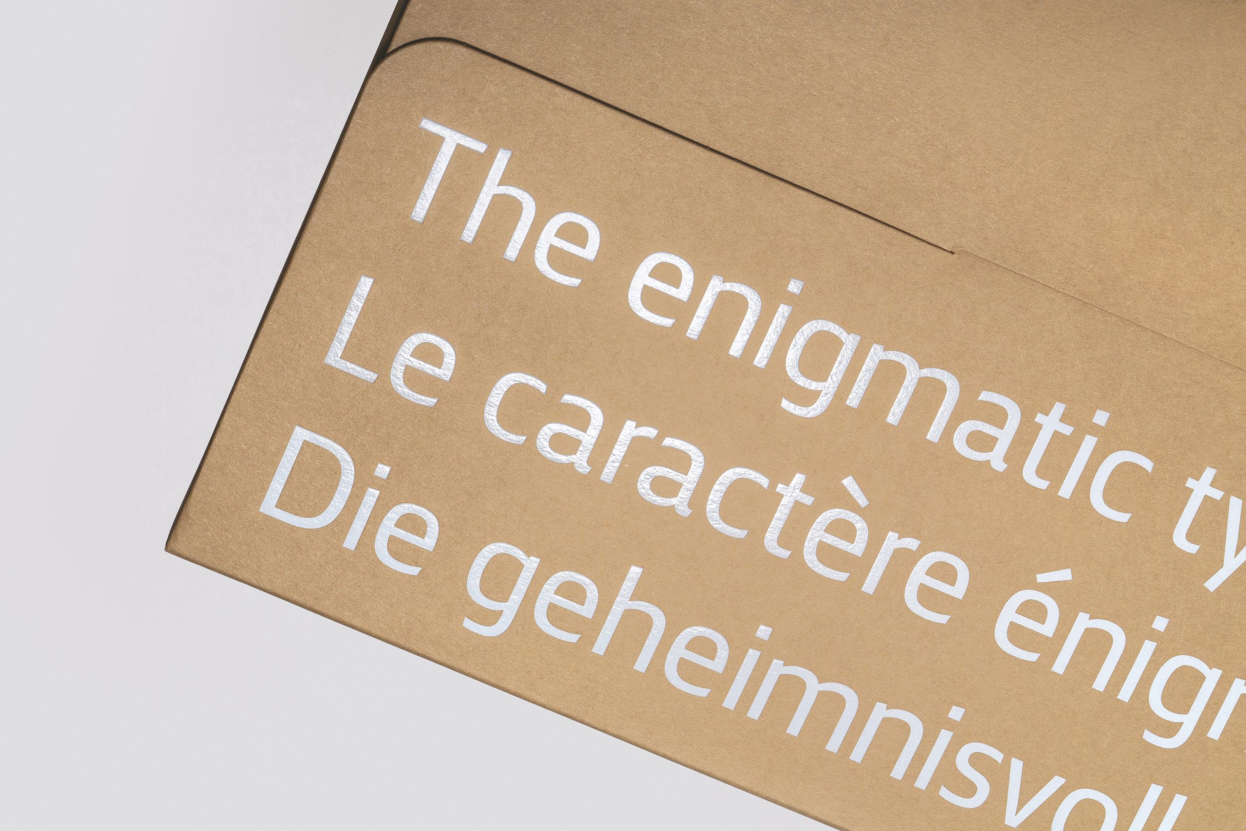
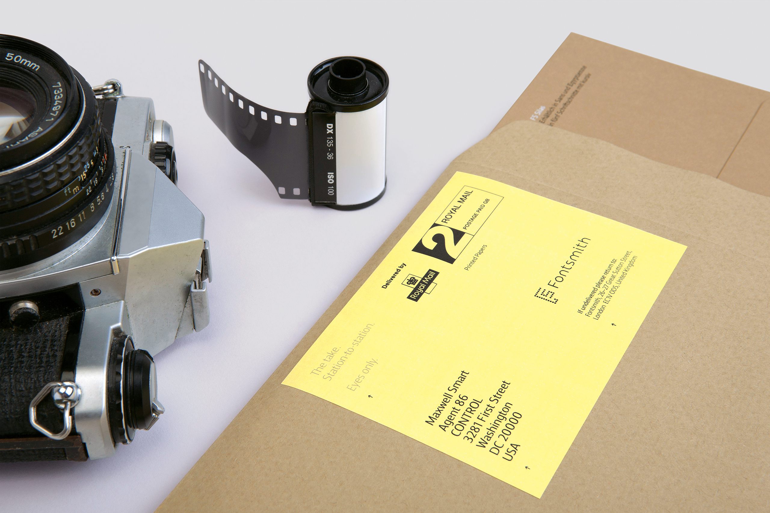
The central idea was inspired by classic espionage, providing plenty of material and intrigue to work with. At its heart sits a beautiful printed type specimen. Using different paper stocks and page sizes printed only in black ink with white foil on the covers, it references dossiers and secret files as well as the classic type specimens of the 1950s and 60s. Content was drawn from numerous sources, providing a glimpse into a clandestine world.
To accompany the specimen, we worked with creative collective The Space Between, who made a series of short and intriguing films using only the typeface itself, each one revealed in sequence on social media in advance of the launch date. This was then followed up with a month-long online advertising campaign.
Disciplines
- Research
- Naming
- Copywriting
- Digital development
- Advertising
