Brief
A new district energy brand designed to work with and support local communities.
Solution
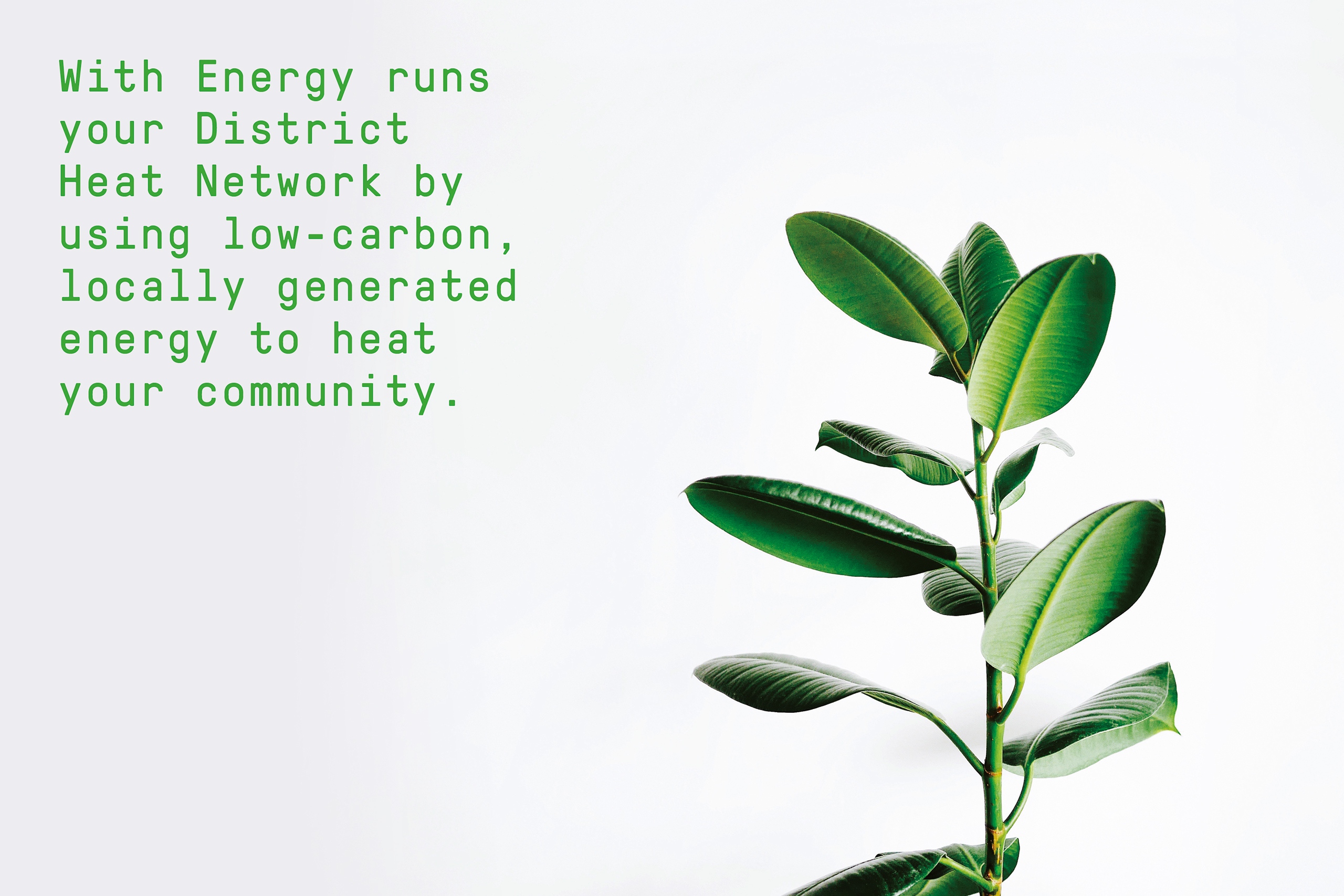
Strategy, naming, identity and design. Pinnacle Power builds local energy networks. The name, developed as their core customer-facing identity, reflects the sense of partnership that each new network aims to build, and the enthusiasm that customers can expect to enjoy.
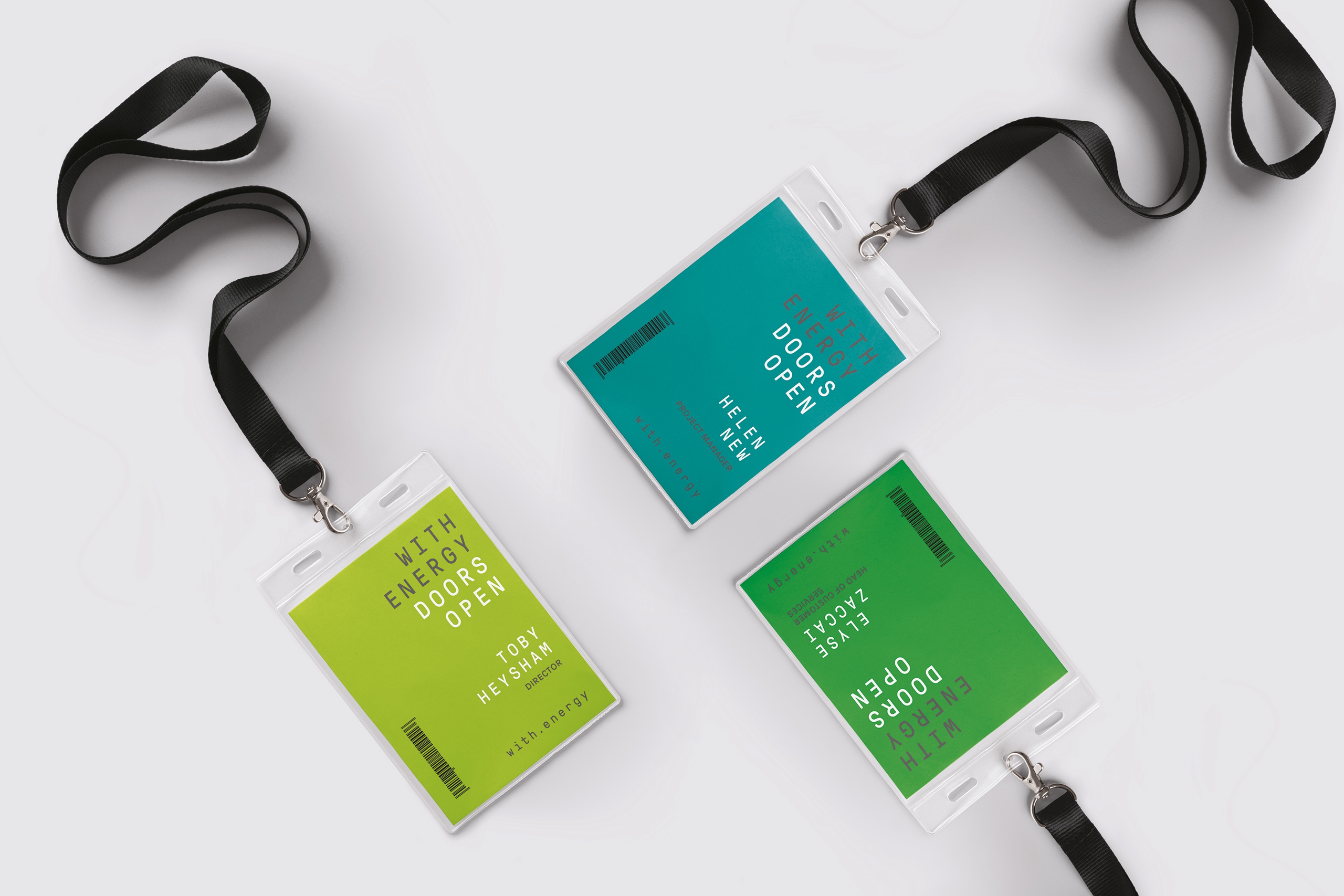
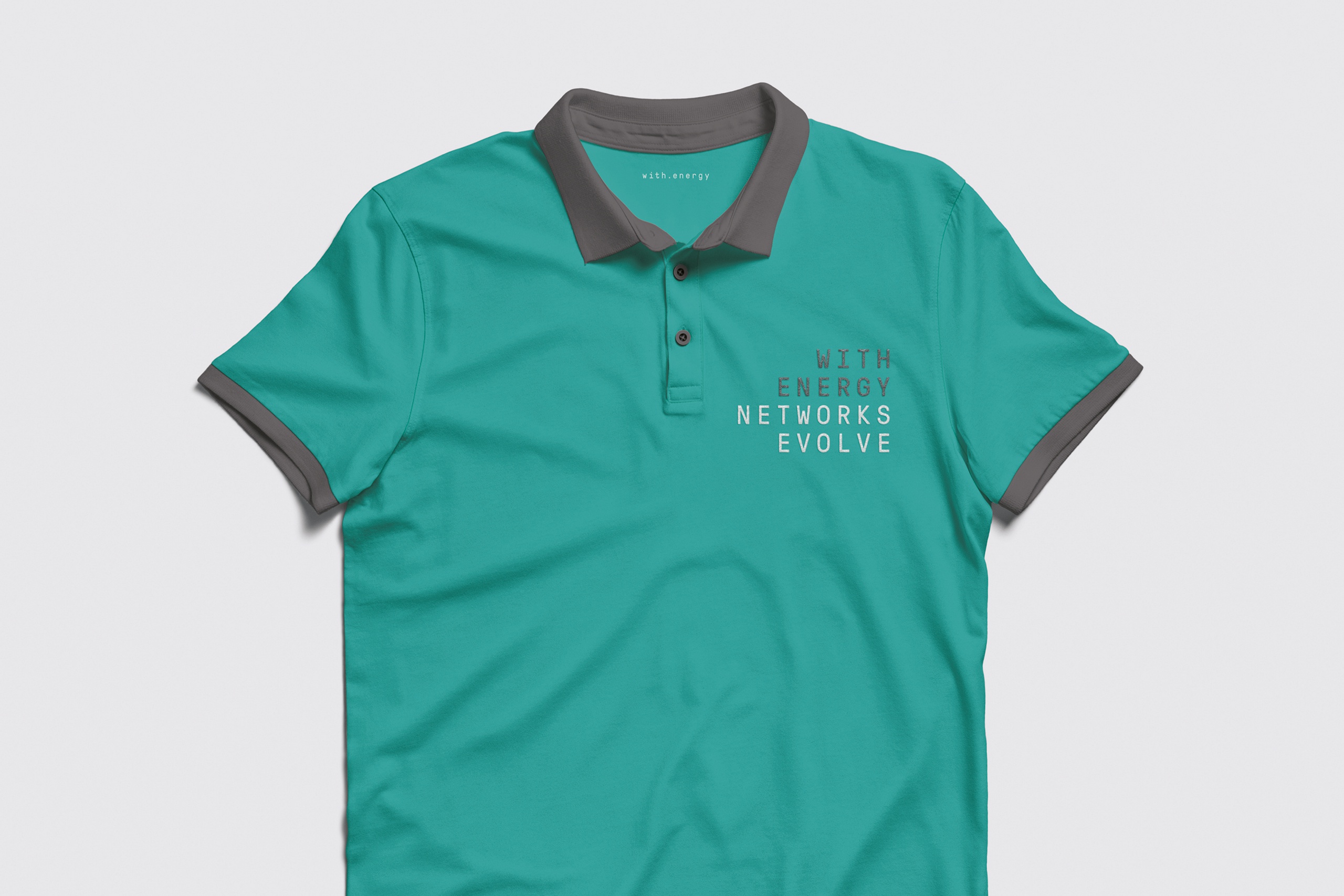
The identity is set using a monospaced typeface on a consistent grid. This is used in a variety of ways, incorporating local communities or combining to create key messages. The blue/green colour palette reflects their focus on sustainable energy. Supporting imagery features people using energy together in domestic and community settings.
We produced simple identity guidelines and a suite of publications to support the customer on-boarding experience.
Disciplines
- Research
- Strategy
- Naming
- Identity