Brief
To create a pure, refined brand identity and packaging design for EONCE CHOCOLATE, a small ‘bean-to-bar’ factory based in East London, UK.
Solution
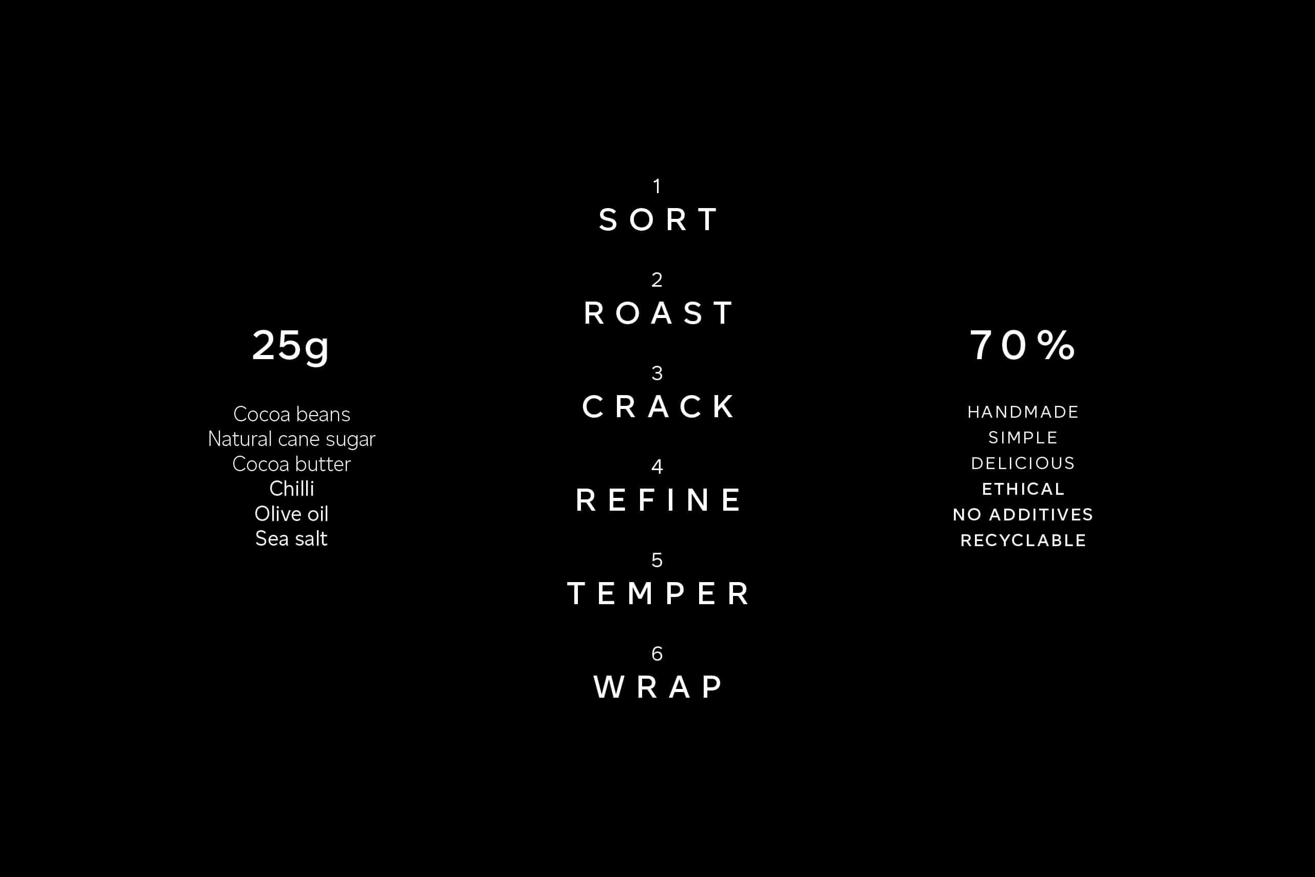
Founded by Spanish-born Julia Martin and Jose Jara, EONCE CHOCOLATE’s focus is on making high quality, simple and delicious chocolate, which has been ethically sourced and produced without any additives. EONCE is an experience of purity and alchemy.
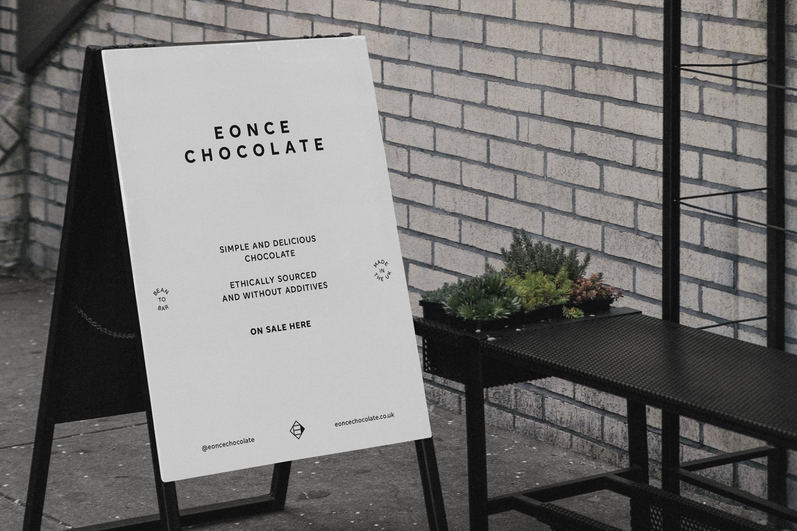
The direction for the brand is in alignment with the products themselves: intentionally pure and free of unnecessary ornamentation. The approach is typographically-driven, using CoType Foundry’s Altform for its geometric simplicity and distinctive characteristics. As the first piece of commercial work to use the typeface, it was fitting that EONCE CHOCOLATE are only 10 minutes down the road from the foundry.
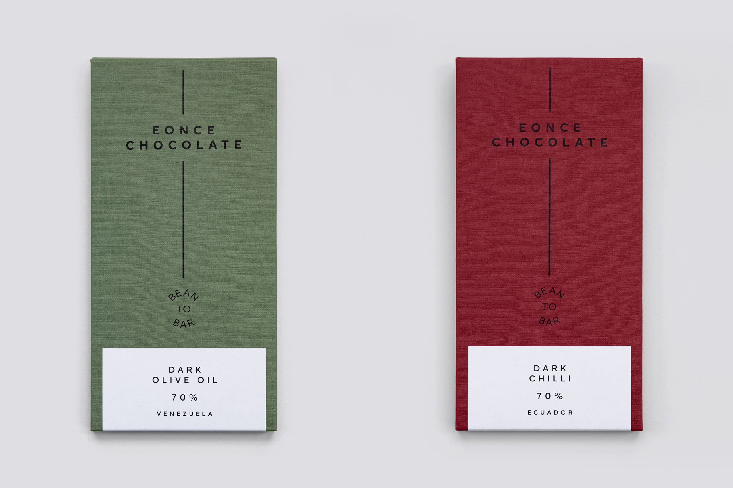
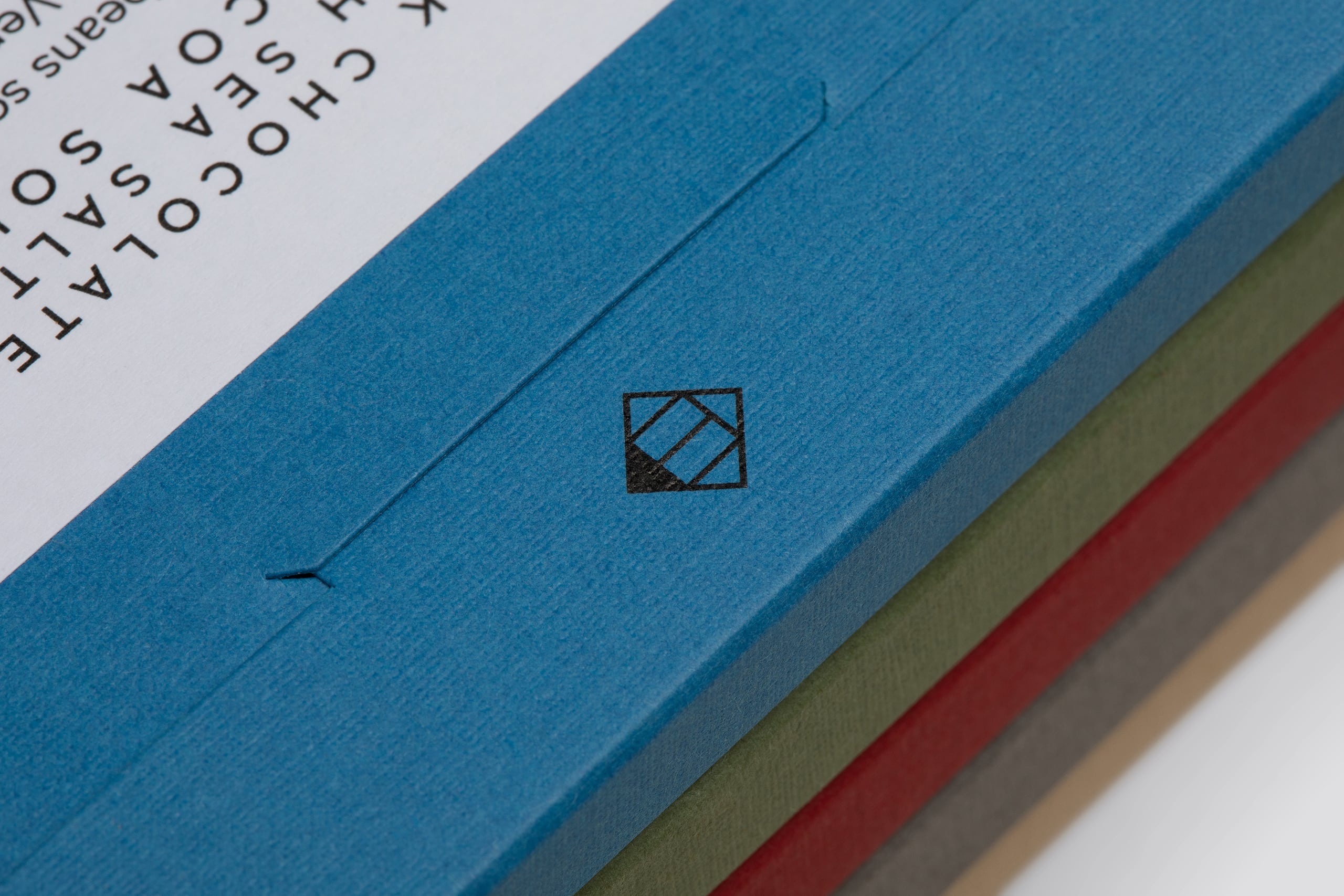
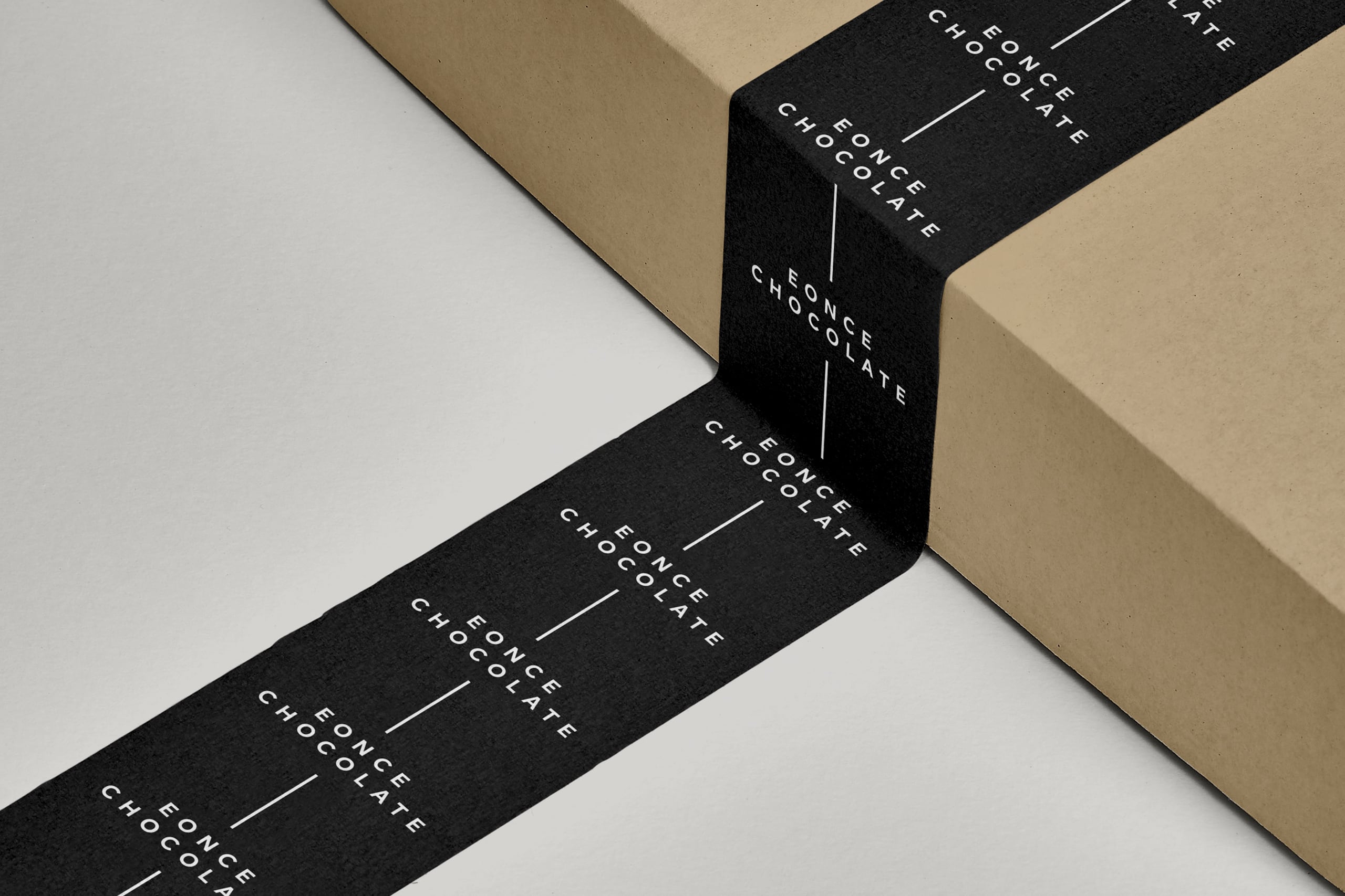
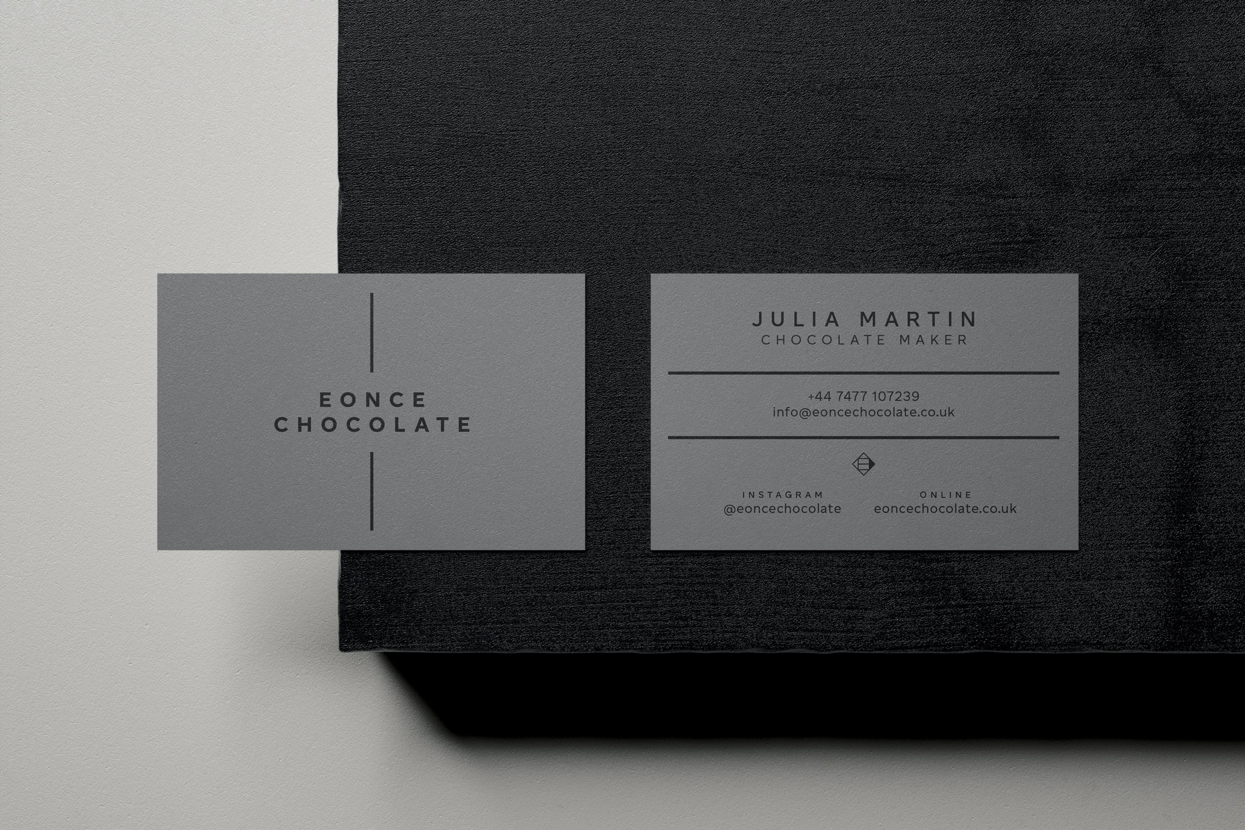
Elements of the brand identity take cues from the company name, which represents their E11 postcode — E for East, and ONCE (pronounced 'on-say') is Spanish for eleven. As an artisan producer, a maker's mark felt appropriate: the symbol connects to the triangular, faceted surface of the bars, whilst combining an E and an arrow with its cardinal direction pointing East. On the packaging itself, the solid all-caps wordmark intersects a vertical line (referencing the bean-to-bar process), reading West to East.
Packaging for the bars uses a selection of Colorplan papers from G.F. Smith — Stone, Smoke, Scarlet, Adriatic, Mid Green and Candy Pink in 270gsm, with a silkweave emboss for a textured finish. The coloured paper stocks create a distinct colour-coded system for varieties, affording scope for future expansion of the product range. Paired with simple white labelling and all printed in black only (consciously minimising waste and ink usage), the finished boxes evoke a sense of luxury whilst remaining true to the craft of chocolate-making and the purity of its ingredients. The restrained design allows the tactile quality of the packaging to act as a fundamental element of the experience; the paper and print working harmoniously together is integral to the success of the project.
“The design and packaging perfectly reflects the ethos of our company and products: honest, crafted and the experience of alchemy that chocolate-making is for us.”
— Julia Martin and Jose Jara, Owners, EONCE CHOCOLATE
Print: Identity Print
Type: Altform, CoType Foundry
Paper: G.F. Smith
Lifestyle photography: Adam Kang
Disciplines
- Identity
- Packaging
- Photography
- Art direction
Project images