Brief
Brand identity development for Broadweigh — wireless load monitoring solutions for the live events industry.
Solution
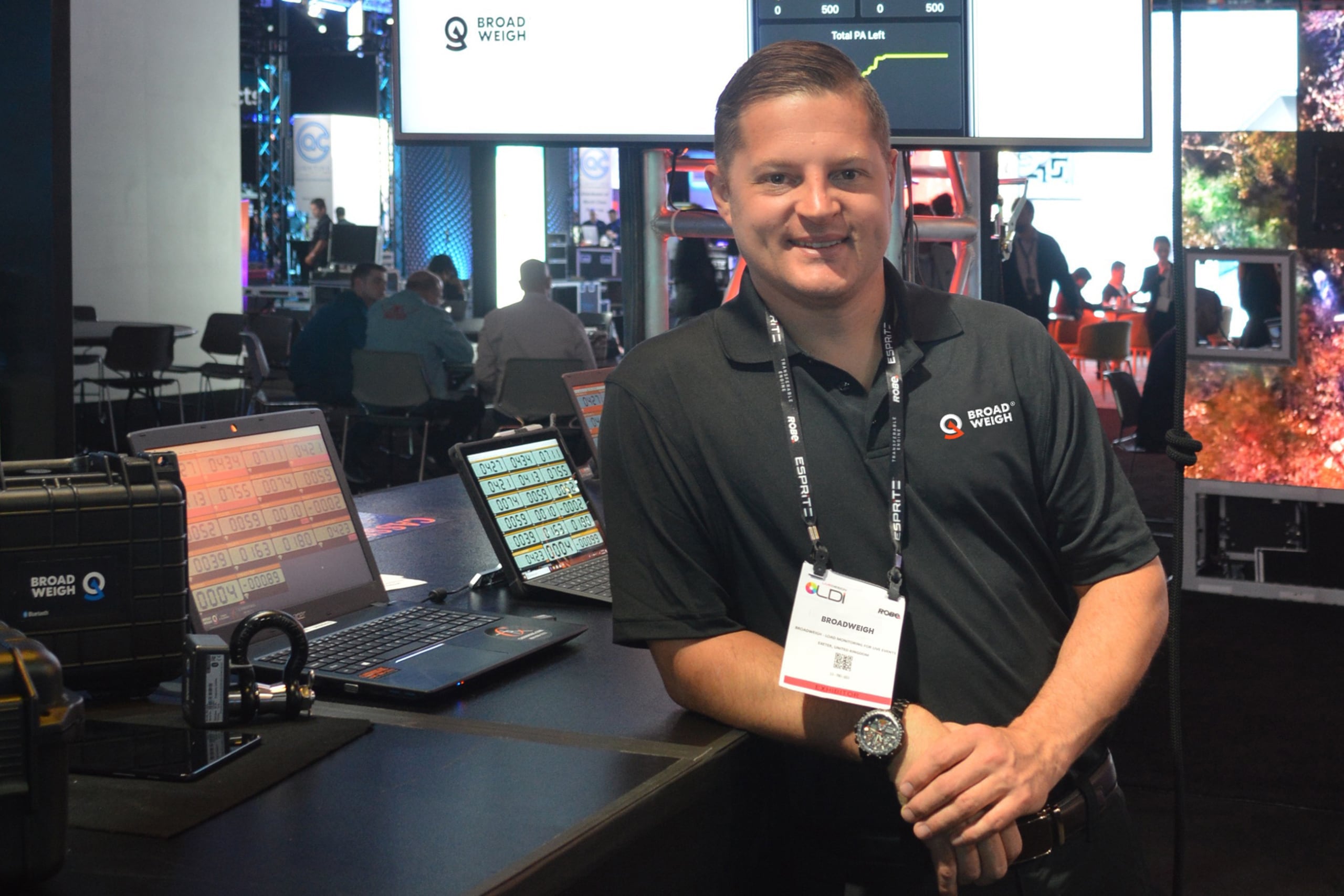
Broadweigh’s products empower rigging professionals to deliver better, safer and more creative outcomes by giving them real-time vital information. With greater knowledge, they can have the confidence to push their abilities further and achieve even more impressive results.
Our creative strategy centred around delivering Bold Clarity, which encompasses Broadweigh’s aim to cut through the noise and deliver the right information simply and succinctly — supporting the talented experts who work behind-the-scenes to bring the biggest shows, productions and events to life.
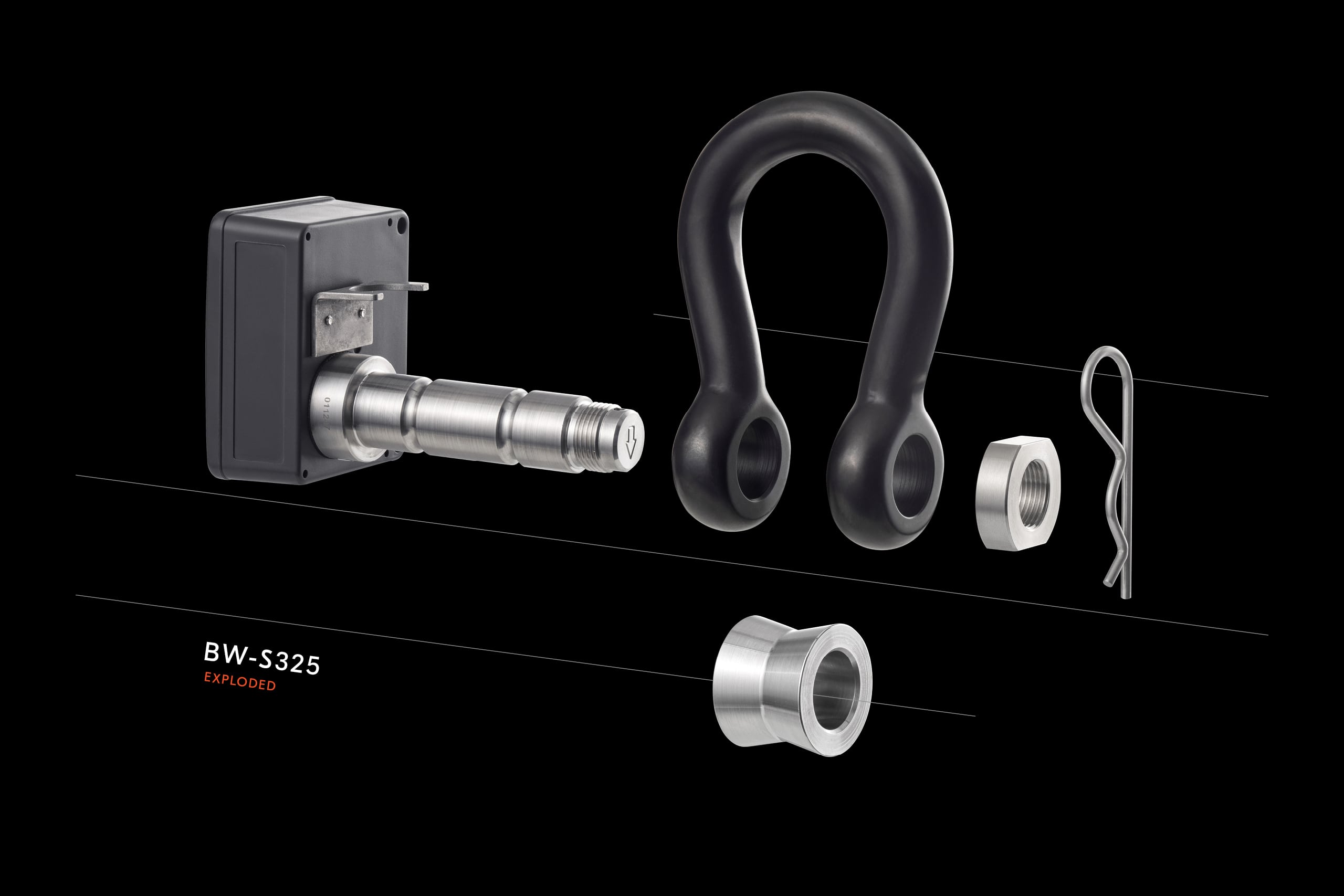
In line with this, the brand identity is dominant and fuss-free, combining a solid wordblock with a geometric representation of a weight sensor — which can be used as a standalone icon. Distinctive and recognisable. A clear statement reflecting Broadweigh’s core values of usability, dependability, flexibility, performance and support.
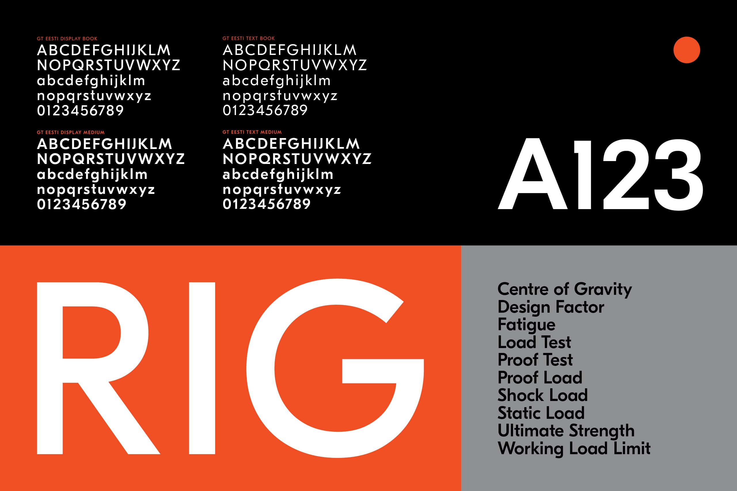
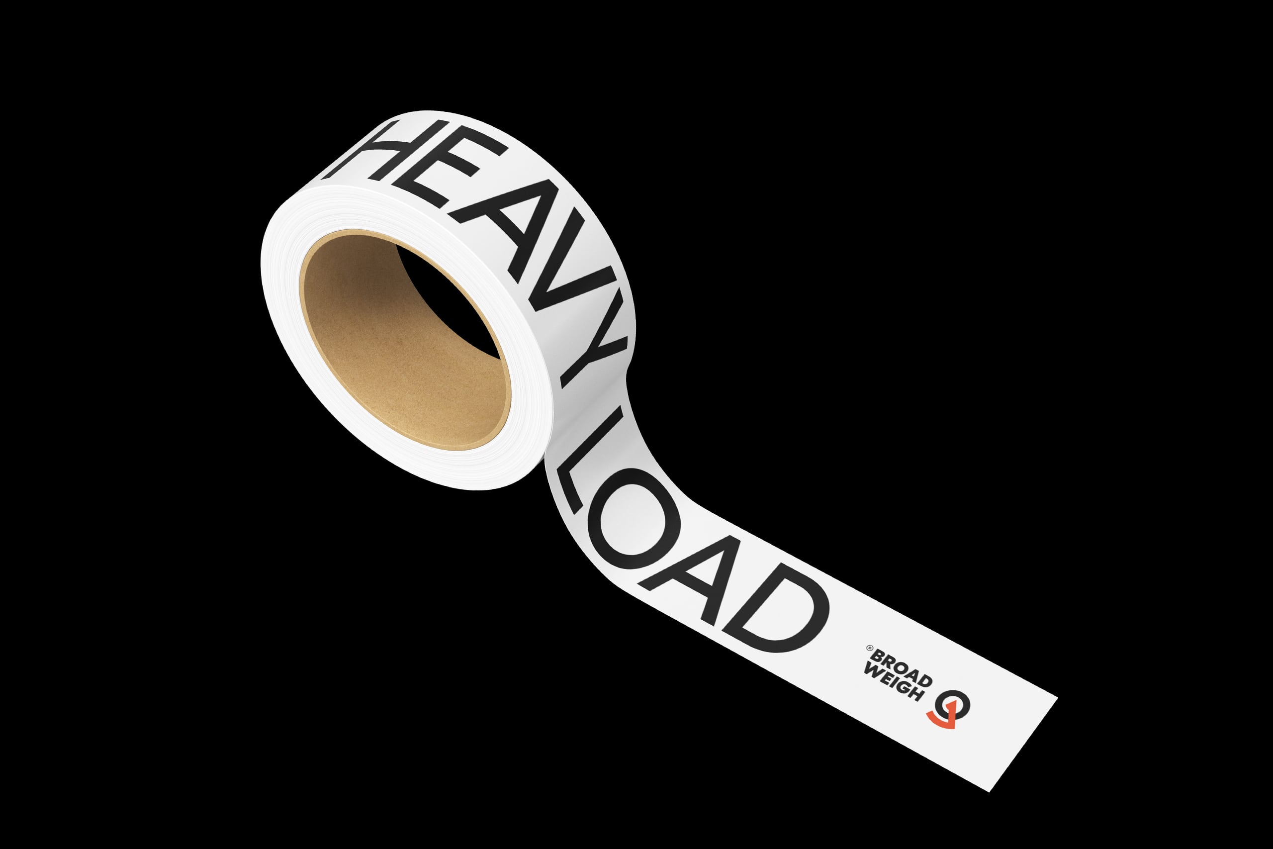
For supporting typography, GT Eesti Display and Text are used for their geometric, refined forms which complement the brand’s positioning and communications — on the one hand offering simple and straightforward information, and on the other a crafted and complex personality doing the hard work in the background. Applications needed to be flexible, allowing for a range of brand expression. From bold and stand-out, to informative and accessible — and at times even inconspicuous as a supporting act.
Following the rebrand, we continue to act as brand guardians and provide support with ongoing campaigns, marketing activity and communications.
Disciplines
- Research
- Strategy
- Identity
- Copywriting
- Illustration
- Marketing Comms
- Merchandise
- Uniforms
- Display
- Advertising


